


 Teilen

English summaries June 1 - 6
Museum für Gestaltung Zürich: Every Thing Design
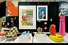
Gift table with peeler
What makes an everyday consumer item to a classic design object? What establishes the meaning of an artefact? The “Every Thing Design” exhibition at the Museum of Design in Zurich offers answers to these questions. Verena Formanek, head of the collection, selected 400 objects from the - since 1875 - continuously growing collections of posters, design, artefacts, and graphics. Thereby Formanek not only makes the transformation of values visible, but also emphasizes the main task of a museum: regarding the art of collecting as a continuous selection procedure among everyday objects - given the ever-changing questions within a socio-cultural environment. The renowned Swiss design studio Oi created an inspiring show, whose open presentation reminds of a gift table.
The exhibition is divided into 9 topics, however, the classification of the objects is in no way conclusive and therefore often incites additional questions: the legendary peeler “Rex” by Alfred Neweczerzal, positioned in the section “Permanence”, could – on account of the stimulus it offered its copycats - easily have also fit into the section “Design Reloaded”. While the potentially scandalous GGK Palmers posters are presented together with Marlboro posters and a lasciviously smoking Fin-de-Siècle lady by Alfons Mucha in the section “Seduction and Information”, the long-lasting bags by Freitag clash with the short-lasting packaging for Swiss Cailler’s Frigor chocolate by Jean Nouvel in the “Life Cycle and Ecology” section. Despite some gaps (which, depending on the viewer, will always be the case) Formanek’s selection is a great success. All significant positions in the field of applied arts are included; and any missing items should be regarded as a variation of those items displayed.
Only the “Guest List”, a selection of individual objects chosen by nine distinguished designers seems inappropriate. Positioned at the end of the exhibition they convey the feeling as if the exhibition needed this kind of a backup from colleagues – something completely unnecessary in view of the quality shown. A selection by celebrated non-designers would have been more refreshing. The exhibition finds its adequate design in the unusual catalogue created by the Dutch book and graphic designer Irma Boom. Her award winning publication is honoured in the poster room of the museum. Whoever is interested in learning more about the fertile cooperation between Swiss design and production should visit the exhibition “Good Design, Good Business – Swiss graphics and advertising for Geigy 1940 – 1970” - one floor higher.
By Harald Krämer
Museum für Gestaltung Zürich
8005 Zurich, Ausstellungsstrasse 60, until 19.07.09
www.museum-gestaltung.ch
Tresor im BA-CA Kunstforum: Bertram Hasenauer – Eisler Prize
Scenic portraits of propinquity and distance
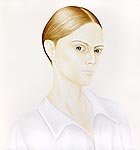
Bertram Hasenauer’s mid- and large-format portrait series (2005 - 2009) fluctuates between the genres of graphics in the style of old masters and contemporary photography. The white background refers to what is missing; those portrayed advance to the centre. Their social background is uncertain. Are they representatives of the working poor or the generation of heirs? Masculine as well as feminine components are put into perspective of the personality structure. How is the reluctant presence addressed by self-control? Among the titles are: “You somehow slip away”, “Long ago and far away”, “All instant things are fading”, and “Still hanging on to what may be”.
Compared to the New Objectivity (1925 – 1935) Bertram Hasenauer points less to the simplicity or beauty of each individual, but concentrates on questioning the authenticity behind the semblance. In the portraits, all painted with subtle colours, the faces narrate of a lengthy and complex biography, which can cause early aging.
The physiognomies of those depicted are accentuated through a distinctive chin, implied cheekbones, and a high forehead. His usage of fine brushes documents his meticulous painting method and claims the recipient’s immediate attention. All of his works are in acryl on wood. Through deconstructing the plasticity with muted and glazed colours he creates a multilayered portrayal. 12 portraits are optimally presented in the 150 square meters of the generous exhibition space of the “Tresor” (vault) at the BA-CA Kunstforum, as well as two landscape paintings titled “Talus”. The dark floor as well as the numerous linear light beams additionally enhance the overall impression and enable one to conjecture the original location where the pictures were created: Berlin.
By Leon Gumil Hainzl
Tresor im BA-CA Kunstforum
1010 Vienna, Freyung 8, until 14.06.09
www.ba-ca-kunstforum.at
Mori Art Museum: The Kaleidoscopic Eye: Thyssen-Bornemisza Art Contemporary Collection
Bright prospects
The soi-disant kaleidoscopic principle can be construed in two different ways: the breaking up, reinterpreting, and remodelling of a contemplative reality – a kind of phenomenological insecurity – or, based on Olafur Eliasson’s words, as “playing with the fact that what we see can easily be messed up or reassembled.” This becomes even more meaningful, as Eliasson, whose works are among the main attractions of the Thyssen-Bornemisza Art Contemporary Collection, are also present at the exhibition currently shown in Tokyo: “The Kaleidoscopic Eye”. The joint Thyssen-Bornemisza Art Contemporary and Mori Art Museum exhibition aims at letting the inspiring title of the “kaleidoscopic eye” be understood in terms of Eliasson’s explicitly stated option. After all, both curators Daniela Zyman (T-B A21) and Araki Natsumi (Mori) quote the famous Icelander in their respective catalogues.
Moreover, one could conceive the kaleidoscopic message according to the word’s etymology as “beautiful to look at”: considering the current rather rough conditions this opens a gateway to a comforting escape from reality. There definitely won’t be any talk of fancy salon art, as the T-B A21 stock is synonymous with progressive contemporary and opulently space filling art. As for example Klaus Weber’s “Public LSD Fountain”, conceptualized for public space, in which psychedelic drugs gurgle in a homeopathic dose (including a certificate of authenticity by the Japanese Homeopathic Society). Well worth seeing are the subtly awkward photo collages by the young artist Haris Epaminonda. A large number of the works presented at this exhibition are well known and were created by renowned artists such as Janet Cardiff, Hans Schabus, Matthew Ritchie or Sarah Lucas. In view of targeting a new audience and the quality of these works it seems advisable to rely on established products.
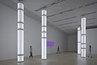
Practically as a central theme - mirrors, light effects, and metallic shiny surfaces accompany the entire exhibition, as in works by Tracey Emin, Cerith Wyn Evans, Carsten Höller, Jim Lambie, Jeppe Hein, John M. Armleder or Olafur Eliasson. Together they form a dazzling and glittering collection of gold laminate, glass chandeliers, disco balls, light pillars, and mirror walls. In the latter, as one knows through Jacques Lacan, lies the justification for the inadequacy of reality, in which a fragmentary human being, who spends his entire life trying to fix imaginary relationships, is captured in a symbolic order. This again allows an inference to Olafur Eliasson’s thought mentioned at the beginning of this text. And above all, it fits well into an exhibit on the top floor of a skyscraping tower with a panoramic view over one of the most important cities of our crisis ridden globe, offering a momentary evasion from the far too bitter reality.
By Daniel Kalt
Mori Art Museum
Tokyo, Roppongi Hills Mori Tower (53f), 6-10-1 Roppongi Minato-Ku, until 05.07.09
www.mori.art.museum
Kunsthalle Krems: Otto Dix – Between Paradise and Collapse
Agony without pity
Numerous artists of the historic avant-garde are underrepresented at national exhibitions. Hannah Höch is one example, as well as George Grosz and a considerable number of Russian Constructivists. Until now Otto Dix was also among them.
Now the Kunsthalle Krems, with its ambitious program for this year- despite cancelling the Birgit Jürgenssen retrospective - dedicated an extensive exhibition to Dix, with special emphasis on his late works. Dix is renowned for his war paintings as well as portraits of people with a low social status. His depictions of women are close to misogyny, and he robs his “harlots”, his “bawds” – first raped, then murdered - and his aged women of the rest of their dignity, and depicts them as nearly deceased. And he does not treat soldiers any better; they are shown speared, crippled, eaten away by worms. He once said “one has to be able to look at agony without wallowing in pity.” Dix presents his lifeless beings unmercifully – disgust stands in the way of sympathy. No one - not Grosz, not Beckman, not Schlichter - is as brutish as he is.
In view of this panorama of the damned, his late works astonish all the more: Dix, stigmatized as degenerate by the National Socialists, painted hyper-realistic landscapes full of pathos in this time of inner emigration, which could be considered as metaphors on war and destruction. Later he devoted himself to the sacral genre, presenting himself as Saint Lucas, painting a Madonna.
One does not find out much about these phases of his work – and even the catalogue does'nt offer much of an explanation. The articles in the catalogue emphasize his war paintings and realistic view – something that is contradictory to this comprehensive retrospective, which concentrates on the entire array of his creativity. But these inconsistencies make no difference to the fact that the exhibition fills a gap.
By Nina Schedlmayer
Kunsthalle Krems
3500 Krems, Franz-Zeller-Platz 3, until 12. 07. 09
www.kunsthalle.at
Mehr Texte von translated and summarized by: Liz Wollner-Grandville
|
||||||||||||