

 Teilen

English summary February 16 - 22
Kunstraum Innsbruck: Amelie von Wulffen
Wrong places for memories
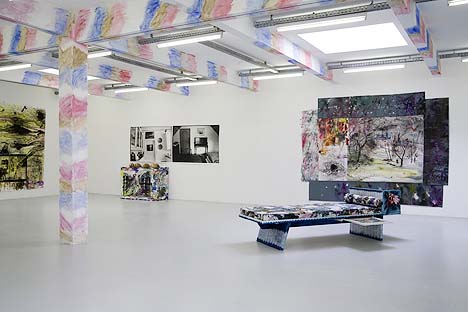
Tyrol’s first solo exhibition in 2009, the year which is embraced by the memories of Andreas Hofer' fight for liberty in 1809, presents Amelie von Wulffen’s works at the Kunstraum Innsbruck. Ironically they fit in quite well, as her memory range includes aspects of collective history, as well as individual impressions.
References to Tyrol are, of course, fictitious and probably even more fictitious than Wulffen’s style of aesthetics, which is based on different art historical influences. But in any case: the sofas shown at this exhibit, designed by Lucio Auri, were decorated by Wulffen in a rustic style, typical of Tyrol and Bavaria.
Wulffens’ collages, which always include an autobiographical connotation, show snapshots of empty Bourgeoisie living rooms, family silver, and antique sideboards. The large format black and white photographs are often painted beyond their frames, thereby extending the radius of memory, and their musty heaviness can relieve itself into the world of art. The city and landscape aquarelles made by an unknown painter - presumably a German soldier – in the 1940s, which are integrated into the show, are also part of the artists’ family property. They depict Breslau and Paris, and at the time of their creation they were probably not much more than travel souvenirs. Seen through the back mirror, these settings of Greater German conquests communicate dark chapters of history. But as Wulffen likes to pursue her fragmented assemblages with a certain easiness, she mounted some of these pictures as resting tables on the sofas. One could easily serve five-o’clock tea on them.
By Ivona Jelcic
Kunstraum Innsbruck
6020 Innsbruck, Maria Theresien Strasse 34, until 28.02.09
www.kunstraum-innsbruck.at
Strabag Kunstforum: Strabag Artaward 08 – Bernhard Buhmann – Scope
Looks pretty old
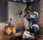
Harlequins and magicians, as well as numerous other sad and destitute figures, who seem to have originated from an early 20th century circus, inhabit Bernhard Buhmann’s large format paintings. Expertly painted, embedded in harmonious compositions, but they lack specific character; something compulsory. The topics are poetic reminiscences of a time long-gone, with distinct connection to de Chirico’s metaphysical paintings. And the paintings with their carefully arranged figures, furniture, and landscapes, unfolding between draped curtains, remind of 17th - 19th century academic paintings. In the recent past, the fact that painting was also a handicraft was often neglected for the benefit of the ecstatic cult of genius. An accusation that does not pertain to Buhman. His works are more likely to run the risk of being positioned in the conservative old master corner.
Wolfgang Pichler
Strabag Kunstforum
1220 Vienna, Donau-City Strasse 9, until 20.03.09
www.strabag-kunstforum.at
Albertina: Gerhard Richter – Retrospective
Gerhard Richter: Profession: Painter
Gerhard Richter’s works haven’t been exhibited in Vienna for the past 22 years and are now presented at the Albertina in a somewhat conglomerated and incoherent form. Originally the show only encompassed paintings from the Baden-Baden based Burda Museum’s private collections. In Vienna the show was supplemented with additional works - both from private collectors, as well as from the artist himself. And to top it off, Barbara Steffen conceptualized a kind of exhibit within the exhibit, presenting rarely displayed aquarelles, drawings, oil on paper works, and 31 monotypes.
The resultant diversity begins with Richter’s frequently cited statement (1966): “I don’t deliberately follow any intention, any system, any direction, I don’t have any program, any style, any purpose.” The exhibition organizers must have based their compilation on similar ideas.
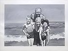
Richter’s painting titled “Family at the seaside” proves his fascinating paintbrush control and outstanding capability to catch the summer sunlight with such reduced colours as gray, black, and white.
Apart from his motifs, Richter’s works could easily be related to those of Titian, Vermeer, or Caspar David Friedrich. But the danger of being seen as a traditionalist lead Richter to create his own aesthetics; these allowed him to link romantic traditions and Baroque facets with his own achievements. He was able to paint landscapes, whose high horizons remind of 17th century Dutch paintings, and romantic depictions of people remind of Caspar David Friedrich.
But there is one thing this Richter-Retrospective lacks: his works dealing with social issues. The artist, who always rejected ideological interpretations – something he ascribed to his childhood experience during the Nazi regime and growing up under GDR-Socialism - created disturbing paintings of corpses of Stammheim prisoners, which are not shown in this exhibit. All in all, the show is an attempt to learn more about the phenomenon Richter and to bring it closer to a broad audience.
By Susanne Rohringer
Albertina
1010 Vienna, Albertinaplatz 1, until 03.05.09
www.albertina.at
Kunstforum der Bank Austria: George Braque
The second one on the rope
Painting can be considered as a specific and systematic way of designing a beautiful surface. Next to the many well-known names that are linked to the specifically elegant and discrete appearance of art, and, on account of the long time span in which artists have been painting, an equally lengthy history was established. A history, which recognizes two revolutions of art: the introduction of perspective during the Renaissance and, following the 500 years in which this tradition was cultivated, the introduction of the Cubistic perspective.
Georges Braque described the intensive work relationship with Picasso, during which the Cubistic perspective was developed, “a bit like a roped party in the mountains.” For many years the public perceived Picasso to be the one who made it to the summit first. But it was probably Braque, whose father was a stage painter, who came up with the idea to paste wood-grained wallpaper onto a painting to produce a materialistic reference without an illusionistic depiction.
Braque created numerous pieces on dark backgrounds; the colour red was only used to depict lights. The primary themes are still lifes, whose easily comprehensible arrangements allowed Braque to show space from various viewpoints. His paintings never come across as pusillanimous or stressed. Work processes, which required years, seem as if they were finalized in a whiff. It is never clear that Braque survived two world wars as well as the world economic crisis, and continued to paint – but it is apparent everywhere that one acquires richness through seeing. Who has ever seen a jug resembling a red puddle?
Gesche Heumann
Kunstforum der Bank Austria
1010 Vienna, Freyung 8, until 01.03.09
www.kunstforumwien.at
Mehr Texte von translated and summarized by: Liz Wollner-Grandville
|
||||||||||||